Chapter 2 of Machine Learning for Hackers is called Data Exploration. It explains means, medians, quartiles, variance, histograms, scatterplots, things like that. It’s a quick and effective introduction to some basic statistics. If you know stats pretty well you can probably skip it, but I found it pretty useful for its intro to the ggplot2 package.
The data they explore is collection of heights and weights for males and females. You can download it here. The authors explore the data by creating histograms and scatterplots.
Here’s how they create a histogram of the heights:
ggplot(ch2, aes(x = Height)) + geom_histogram(binwidth=1)
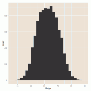
Changing the binwidth parameter changes the size of the bins in inches. They also create kernel density estimates (KDE):
ggplot(ch2, aes(x = Height)) + geom_density()
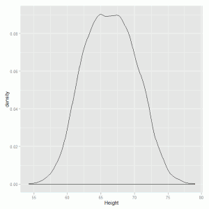
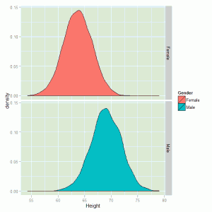
Notice that line of code is the same as the histogram code but with a different function called after the “+”. Now that plots all the height data. They then show you how create two different KDEs for each gender:
ggplot(ch2, aes(x = Height, fill=Gender)) + geom_density() + facet_grid(Gender ~ .)
Histograms are good for one variable. If you want to explore two numeric variables, you bust out a scatterplot. Continuing with ggplot, they do the following:
ggplot(ch2, aes(x = Height, y = Weight)) + geom_point()
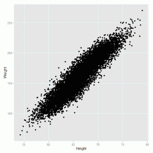
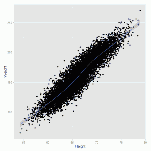
There’s your scatterplot. Next they show how to easily run a smooth prediction line through the plot with a confidence band:
ggplot(ch2, aes(x = Height, y = Weight)) + geom_point() + geom_smooth()
Then they show you again how to distinguish between gender:
ggplot(ch2, aes(x = Height, y = Weight, color = Gender)) + geom_point()
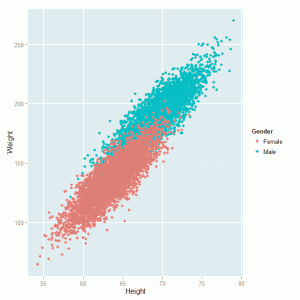
Using this last scatterplot with genders called out, they decide to give a sneak preview of machine learning using a simple classification model. First they code the genders as Male=1 and Female=0, like so:
ch2 <- transform(ch2, Male = ifelse(Gender == 'Male', 1, 0)
Then they use glm to create a logit model that attempts to predict gender based on height and weight:
logit.model <- glm(Male ~ Height + Weight, data=ch2, family=binomial)
Finally they redraw the scatterplot, but this time use the logit model parameters to draw a "separating hyperplane" through the scatterplot:
ggplot(ch2, aes(x = Height, y = Weight, color = Gender)) + geom_point() +
 stat_abline(intercept = - coef(logit.model)[1] / coef(logit.model)[3],
 slope = - coef(logit.model)[2] / coef(logit.model)[3],
 geom = 'abline', color = 'black')
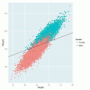
The formula for the line is \( y = - \frac{\alpha}{\beta_{2}} - \frac{\beta_{1}}{\beta_{2}}\). They don't tell you that in the book, but I thought I would state that for the record. Also the code in the book for this portion has typos and draws something different. What I provide above replicates Figure 2-31 in the book.
Again I felt like this was a solid intro to the ggplot package. And of course it's never bad to review the basics. "You have to be sound in the fundamentals" as sports analysts are fond of saying.
One comment