I want to document in one place some of the ways I carry out simple linear regression in R. To illustrate I’ll use a problem from the textbook Probability and Statistical Inference, 7th edition by Hogg and Tanis. The problem gives the times of 22 swimmers in the 50 yard freestyle at a hypothetical championship meet. For each swimmer there are two times: (1) their best time for the season, and (2) their time in the championship meet. We wish to regress the time in the meet on the best time of the season to see if there is a linear relationship between the two.
First we read in the data:
swim <- read.table("C:/My Documents/hogg_tanis_data/Exercise_6_12-10.txt",header=T)
swim <- swim[order(swim$x),]
The read.table function seems to work without fail for me. As long as the source data is in columns and there is clear separation between the columns, it works like a charm. If the first row has column headers, then set "header=TRUE". The second line of code simply orders the data by x, which is the best times of the season. Now we're ready to carry out the regression:
swim.mod <- lm(y~x,data=swim)
plot(swim$x,swim$y)
abline(swim.mod)
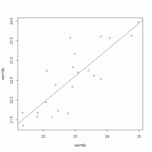
The first line carries out the regression. The second line creates a scatter plot of the pairs of times for the 22 swimmers. The third line adds the regression line to the plot. Now usually I would do the scatter plot first. That alone may tell you whether or not simple linear regression is appropriate. Of course in this case we know it's appropriate, because well, that's the chapter this problem comes from. Here's what we get:
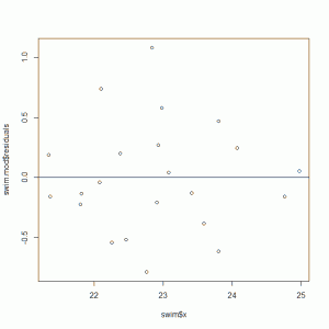
Now let's examine the residuals to check our assumption of constant variance:
plot(swim$x,swim.mod$residuals)
abline(0,0)
Not too bad, I guess, though the variance seems to taper off in the extremes. This matches what we see in the scatterplot and regression line, where the points in the extremes are closer to the line than those points in the middle. This suggests that swimmers with the better times in season tend to have the better times in the meet. Same with the slower swimmers. In the middle, however, we see a lot of variation.
Now let's take a look at the formula for that regression line:
summary(swim.mod)
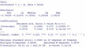
gives us the following output:
We see the estimated regression line is \( y = 7.18 + 0.67x \) and that both the intercept and slope are significantly different from 0. That's what the low p-values tell us. The intercept has no interpretation here since x is never 0. The slope says that two swimmers who differed by 1 second in "best time during season" will differ by 0.67 seconds in "time in the championship meet". Again these are estimates, so it's not worth getting too attached to the precision of the estimates in the output. That's why I reported the slope as 0.67 instead of 0.6705. How precise are these estimates? Let's look at the 95% confidence intervals for the parameters:
The lower bound of the slope is about 0.56 and the upper bound is about 0.88. We're reasonably confident the true slope is between those two bounds. The process we used captures the true slope 95% of the time. We'd like to think this time it worked and the true slope is in the interval of (0.45,0.88).
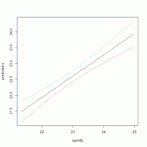
Finally let's add 90% confidence bands to our scatterplot and regression line. This will give us a general idea of how good our regression line is for predicting a mean "meet time" value for a given "best time in season" value:
conf.band <- predict(swim.mod, interval="confidence", level=0.90)
matplot(swim$x,conf.band, type="l", lty=c(1,2,2), ylab="predicted y")
The first line of code makes predictions of the means. The second line creates the plot. The matplot function plots vectors versus a matrix. In this case it plots the x values versus (1) the fitted values, (2) the upper limits, and (3) the lower limits. The result looks like this:
You can see it pinches in the middle where we have more data and thus more confidence about our predicted means. It appears on average that times improve in the final meet. For example, of people who reported a best time of 23 seconds during the season, the average of these same people at the meet looks to be about 22.5 (give or take a couple of tenths of seconds).


